top of page

Create account
+91 96113 44773
Search


Stop Struggling with PAN Extraction 😳 | Excel REGEX Trick You Must Know!
Struggling to extract PAN numbers from messy text in Excel? 🤯 In this quick tutorial, learn how to use REGEXEXTRACT to pull PAN numbers instantly — no manual work, no errors! Perfect for: ✔ Data Analysts ✔ Finance Professionals ✔ Excel Users ✔ Beginners in Data Cleaning 👉 One formula can save hours of effort!

Vijay Perepa
Apr 121 min read

Vijay Perepa
Apr 110 min read

Vijay Perepa
Apr 30 min read
Exploring the Power of MCP with SQL – A Practical Demo
Recently, I set up an MCP (Model Context Protocol) Server for SQL and spent some time exploring how effectively it can interact with databases through AI-driven workflows....... Recently, I set up an MCP (Model Context Protocol) Server for SQL and spent some time exploring how effectively it can interact with databases through AI-driven workflows. The experience was quite impressive. With MCP acting as a standardized bridge between AI models and external tools, it becomes pos
Vijay Perepa
Apr 21 min read

Vijay Perepa
Apr 20 min read
Microsoft Fabric Data Engineering Explained Lakehouse, Spark and OneLake Architecture
Microsoft Fabric Data Engineering Explained Lakehouse, Spark and OneLake Architecture Watch Video 🎥 In this video, we explore Microsoft Fabric Data Engineering in a clear and structured way. You will understand: • Lakehouse architecture and why it combines Data Lake flexibility with Data Warehouse performance • How Apache Spark works inside Fabric • Notebooks and Spark Job Definitions for production workloads • Medallion architecture (Bronze, Silver, Gold) • How OneLake acts
Vijay Perepa
Mar 41 min read
Microsoft Fabric Data Factory Explained Simply | Pipelines, Copy Job, Mirroring & Copilot
In this video, I explain Microsoft Fabric Data Factory in a simple and practical way for learners, working professionals, and anyone exploring modern data integration. You will understand how Data Factory acts as the core engine for enterprise data movement and orchestration inside Microsoft Fabric. I cover the major capabilities, including: * Data integration across 170+ sources** * Power Query Dataflows** * Pipelines and orchestration** * Copy Job** * Database Mirroring**
Vijay Perepa
Feb 271 min read


Master Power Automate String Functions with Real Data | Substring, FormatDateTime, Concat & More!
Start Learning Power Automate and find how to combine String, Date, and Mathematical functions to build dynamic workflows! In this video, I’ll walk you through real business data, showing how functions like substring(), concat(), formatDateTime(), nthIndexOf(), and mathematical expressions can automate real-world processes effortlessly. You’ll also get the complete dataset used in this tutorial — so you can practice, follow along, and create your own intelligent automations.
Vijay Perepa
Nov 9, 20251 min read


How to Analyze Latest N Months Sales
Watch Video here https://www.youtube.com/watch?v=0sVrr2Hr514&t=219s Analysing Last N Months is an excellent way to get a quick,...
Vijay Perepa
Jul 12, 20251 min read


When to use Funnel Chart
When to use Funnel Chart A 𝒇𝒖𝒏𝒏𝒆𝒍 𝒄𝒉𝒂𝒓𝒕 is designed to visually represent data as it moves through various stages of a...
Vijay Perepa
Apr 7, 20251 min read

Data Pipelines in Microsoft Fabric and transform raw data using PySpark
👉👉Watch Video - https://youtu.be/Ptl7USRnj44 👈👈 In this step-by-step tutorial, we’ll show you how to: ✅ Connect and ingest CSV files...
Vijay Perepa
Feb 22, 20251 min read

𝐓𝐫𝐚𝐧𝐬𝐟𝐨𝐫𝐦 𝐃𝐚𝐭𝐚 𝐢𝐧𝐭𝐨 𝐈𝐧𝐬𝐢𝐠𝐡𝐭𝐬: 🦋 𝐁𝐮𝐭𝐭𝐞𝐫𝐟𝐥𝐲 🦋 (🌪️ 𝐓𝐨𝐫𝐧𝐚𝐝𝐨 🌪️) 𝐂𝐡𝐚𝐫𝐭𝐬 𝐟𝐨𝐫 𝐏𝐨𝐰𝐞𝐫𝐟𝐮𝐥 𝐒𝐭𝐨𝐫𝐲𝐭𝐞𝐥𝐥𝐢𝐧𝐠 𝐢𝐧 𝐏𝐨𝐰𝐞𝐫 𝐁𝐈
In data analysis, visualization is key to telling impactful stories. My latest video demonstrates how to create a Butterfly (Tornado)...
Vijay Perepa
Feb 14, 20251 min read
𝐌𝐮𝐥𝐭𝐢𝐩𝐥𝐞 𝐃𝐚𝐭𝐞 𝐅𝐨𝐫𝐦𝐚𝐭𝐬 𝐢𝐧 𝐒𝐚𝐦𝐞 𝐂𝐨𝐥𝐮𝐦𝐧 | 𝐏𝐨𝐰𝐞𝐫 𝐐𝐮𝐞𝐫𝐲
👉👉𝐖𝐚𝐭𝐜𝐡 𝐕𝐢𝐝𝐞𝐨 - https://youtu.be/LaNZt_lf-eo 👈👈 In many of my Excel trainings, and this applies to Power BI as well, I’ve...
Vijay Perepa
Feb 13, 20251 min read

𝐃𝐚𝐭𝐚 𝐈𝐧𝐠𝐞𝐬𝐭𝐢𝐨𝐧 𝐭𝐨 𝐃𝐞𝐥𝐭𝐚 𝐓𝐚𝐛𝐥𝐞 𝐰𝐢𝐭𝐡 𝐃𝐚𝐭𝐚𝐟𝐥𝐨𝐰 𝐆𝐞𝐧2 | 𝐒𝐞𝐭 𝐃𝐞𝐟𝐚𝐮𝐥𝐭 𝐒𝐞𝐦𝐚𝐧𝐭𝐢𝐜 𝐌𝐨𝐝𝐞𝐥 & 𝐁𝐮𝐢𝐥𝐝 𝐑𝐞𝐩𝐨𝐫𝐭𝐬 𝐢𝐧 𝐌𝐢𝐜𝐫𝐨𝐬𝐨𝐟𝐭 𝐅𝐚𝐛
👉👉 𝑾𝒂𝒕𝒄𝒉 𝑽𝒊𝒅𝒆𝒐 https://youtu.be/j9rdXD5mAno 👈👈 #PowerBI #DataAnalytics #ETL #Dataflows #PowerQuery #MicrosoftFabric #Busi...
Vijay Perepa
Feb 11, 20251 min read

𝐁𝐫𝐞𝐚𝐤𝐢𝐧𝐠 𝐃𝐨𝐰𝐧 𝐌𝐢𝐜𝐫𝐨𝐬𝐨𝐟𝐭 𝐅𝐚𝐛𝐫𝐢𝐜 𝐟𝐨𝐫 𝐁𝐞𝐠𝐢𝐧𝐧𝐞𝐫𝐬
Simple Data Ingestion! Watch the full tutorial here 👉 https://lnkd.in/gbxtsMW9 👈 If you've been wondering how to get started with...
Vijay Perepa
Feb 5, 20251 min read
Creating an Animated Circular Progress Bar with SVG
Complete Tutorial (Youtube link) - Below is the snippet for SVG Code with Explanation Introduction SVG (Scalable Vector Graphics) is a...
Vijay Perepa
Feb 1, 20252 min read
𝐒𝐕𝐆 𝐀𝐧𝐢𝐦𝐚𝐭𝐢𝐨𝐧𝐬 𝐢𝐧 𝐏𝐨𝐰𝐞𝐫 𝐁𝐈!
👉👉 Watch Video https://youtu.be/e5eZN0uzB3A 👈👈 Are you looking to enhance your Power BI dashboards with interactive and dynamic...
Vijay Perepa
Feb 1, 20251 min read
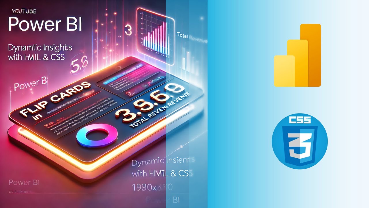
Create Interactive Flip Cards in Power BI with HTML & CSS!
👉👉 Watch Tutorial - https://lnkd.in/gqi56A_i Learn how to use HTML & CSS to create dynamic and engaging flip cards that display...
Vijay Perepa
Jan 4, 20251 min read
bottom of page